Range Slider on Number field
It's possible to easily implement range field type styling/handling on regular Text or Number fields.
Instructions
Step 1
To familiarize yourself with the Range field type, a basic code example looks something like this:
<label>How many pies do you eat per year?</label>
<div class="freeform-range">
  <input
    type="range"
    name="myFieldHandle"
    id="myFieldHandle"
    min="0"
    max="100"
    step="5"
    value="0"
  />
</div>
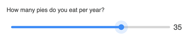
This will output the following (go ahead and play with it!):
How many pies do you eat per year?
Step 2
What you might like to do is replace Number fields with a range slider. The Number field allows you to configure the Range features from inside the form builder. Your code can then include things like minValue, maxValue, step, and defaultValue:
{{ field.renderLabel() -}}
<div class="freeform-range">
    <input type="range" min="{{ field.minValue }}" max="{{ field.maxValue }}" step="{{ field.step }}" value="{{ field.defaultValue ? field.defaultValue : '0' }}" name="{{ field.handle }}" id="form-input-{{ field.handle }}" />
    <span>{{ field.defaultValue ? field.defaultValue : '0' }}</span>
</div>
Step 3
To add a bit of your own styling to the Range field, you can begin with the following CSS:
.freeform-range {
  display: flex;
  align-items: center;
  max-width: 500px;
  height: 4rem;
  width: 80%;
  padding: 0px 10px;
}
.freeform-range input[type='range'] {
  -webkit-appearance: none;
  appearance: none;
  width: 100%;
  height: 6px;
  cursor: pointer;
  outline: none;
  border-radius: 15px;
  padding: 0 !important;
  border: 0 !important;
  background: #d6d6d6;
}
.freeform-range input[type='range']::-webkit-slider-thumb {
  -webkit-appearance: none;
  appearance: none;
  height: 15px;
  width: 15px;
  background-color: #058ffe;
  border-radius: 50%;
  border: none;
  transition: all 0.25s;
}
.freeform-range input[type='range']::-moz-range-thumb {
  height: 15px;
  width: 15px;
  background-color: #058ffe;
  border-radius: 50%;
  border: none;
  transition: all 0.25s;
}
.freeform-range input[type='range']::-webkit-slider-thumb:hover,
.freeform-range input[type='range']:active::-webkit-slider-thumb {
  box-shadow: 0 0 0 10px rgba(5, 143, 254, 0.15);
}
.freeform-range input[type='range']::-moz-range-thumb:hover,
.freeform-range input[type='range']:active::-moz-range-thumb {
  box-shadow: 0 0 0 10px rgba(5, 143, 254, 0.15);
}
.freeform-range span {
  font-size: 20px;
  width: 40px;
  text-align: center;
}
Then include the following JS in order to handle the output of value selected in the range, and correctly style the progress bar:
const freeformRange = document.querySelector(
  '.freeform-range input[type=range]'
);
const freeformRangeValue = document.querySelector('.freeform-range span');

freeformRange.addEventListener('input', (event) => {
  const freeformRangeValueProgress = event.target.value;
  freeformRangeValue.textContent = freeformRangeValueProgress;

  const progress = (freeformRangeValueProgress / freeformRange.max) * 100;

  freeformRange.style.background = `linear-gradient(to right, #058ffe ${progress}%, #d6d6d6 ${progress}%)`;
});
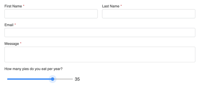
The result should look something like this:
Step 4
In order for this to automatically happen inside a formatting template, you'll want to create a new one if you haven't already. If you using the Basic Light formatting template as a starting point, your code might look something like this:
{# Shortened for Example #}
...
{% for row in form %}
<div class="freeform-row {{ form.customAttributes.rowClass }}">
    {% for field in row %}
    {% set width = (12 / (row|length)) %}
    {% set columnClass = "freeform-col-" ~ width %}
    {% set columnClass = columnClass ~ form.customAttributes.columnClass %}
    {% if field.type == "submit" or field.type == "save" %}
        {% set columnClass = columnClass ~ " freeform-column-content-align-" ~ field.position %}
    {% endif %}
    <div class="{{ columnClass }} freeform-fieldtype-{{ field.type }}"{{ field.rulesHtmlData }}>
        {% if field.type in ["checkbox", "mailing_list"] %}
            {{ field.renderInput({ class: "freeform-input" ~ (field.hasErrors ? " is-invalid") }) -}}
            {{- field.renderLabel({ labelClass: "freeform-label" ~ (field.inputOnly ? " freeform-input-only-label" : "") ~ (field.required ? " freeform-required" : "") }) }}
            {{ field.renderInstructions({ instructionsClass: "freeform-instructions" }) }}
            {{ field.renderErrors({ errorClass: "freeform-errors" }) }}
        {% elseif field.type == "number" %}
            {{ field.renderLabel({ labelClass: "freeform-label" ~ (field.inputOnly ? " freeform-input-only-label" : "") ~ (field.required ? " freeform-required" : "") }) }}
            <div class="freeform-range">
                <input type="range" min="{{ field.minValue }}" max="{{ field.maxValue }}" step="{{ field.step }}" value="{{ field.defaultValue ? field.defaultValue : '0' }}" name="{{ field.handle }}" id="form-input-{{ field.handle }}" />
                <span>{{ field.defaultValue ? field.defaultValue : '0' }}</span>
            </div>
            {{ field.renderInstructions({ instructionsClass: "freeform-instructions" }) }}
            {{ field.renderErrors({ errorClass: "freeform-errors" }) }}
        {% else %}
            {{ field.render({
                class: field.type not in ["submit", "save", "signature"] ? "freeform-input" : "",
                labelClass: "freeform-label" ~ (field.inputOnly ? " freeform-input-only-label" : "") ~ (field.required ? " freeform-required" : ""),
                errorClass: "freeform-errors",
                instructionsClass: "freeform-instructions",
            }) }}
...
{# Shortened for Example #}
Don't forget to include the custom CSS and JS that was mentioned in Step 3.
The result might look something like this:
Please see MDN Web Docs for more information about Range input elements.