Color Picker on Text field
It's possible to easily implement color field type styling/handling on a regular Text field.
Step 1
To familiarize yourself with the Color field type, a basic code example looks something like this:
<label for="myFieldHandle">Choose a Color</label>
<input type="color" name="myFieldHandle" id="myFieldHandle" value="#058ffe" />
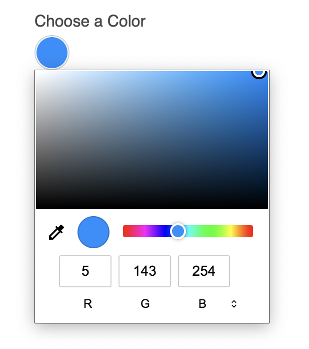
This will output the following (go ahead and play with it!):
Choose a Color
Step 3
To add a bit of your own styling to the Color field, you can begin with the following CSS:
input[type='color'] {
  -webkit-appearance: none;
  border: 1px solid #cbced0 !important;
  border-radius: 50% !important;
  width: 35px !important;
  height: 35px !important;
  padding: 1px !important;
  cursor: pointer;
}
input[type='color']::-webkit-color-swatch-wrapper {
  padding: 0;
}
input[type='color']::-webkit-color-swatch {
  border: none;
  border-radius: 50%;
}
input[type='color']::-moz-color-swatch {
  border: none;
  border-radius: 50%;
}
There is no javascript necessary for this to work.
The result should look something like this:
Step 4
In order for this to automatically happen inside a formatting template, you'll want to create a new one if you haven't already. If you using the Basic Light formatting template as a starting point, your code might look something like this:
{# Shortened for Example #}
...
{% for row in form %}
<div class="freeform-row {{ form.customAttributes.rowClass }}">
    {% for field in row %}
    {% set width = (12 / (row|length)) %}
    {% set columnClass = "freeform-col-" ~ width %}
    {% set columnClass = columnClass ~ form.customAttributes.columnClass %}
    {% if field.type == "submit" or field.type == "save" %}
        {% set columnClass = columnClass ~ " freeform-column-content-align-" ~ field.position %}
    {% endif %}
    <div class="{{ columnClass }} freeform-fieldtype-{{ field.type }}"{{ field.rulesHtmlData }}>
        {% if field.handle == "selectColor" %}
            {{ field.renderLabel({ labelClass: "freeform-label" ~ (field.inputOnly ? " freeform-input-only-label" : "") ~ (field.required ? " freeform-required" : "") }) }}
            <input type="color" id="form-input-{{ field.handle }}" name="{{ field.handle }}" value="#058ffe">
            {{ field.renderInstructions({ instructionsClass: "freeform-instructions" }) }}
            {{ field.renderErrors({ errorClass: "freeform-errors" }) }}
        {% elseif field.type in ["checkbox", "mailing_list"] %}
            {{ field.renderInput({ class: "freeform-input" ~ (field.hasErrors ? " is-invalid") }) -}}
            {{- field.renderLabel({ labelClass: "freeform-label" ~ (field.inputOnly ? " freeform-input-only-label" : "") ~ (field.required ? " freeform-required" : "") }) }}
            {{ field.renderInstructions({ instructionsClass: "freeform-instructions" }) }}
            {{ field.renderErrors({ errorClass: "freeform-errors" }) }}
        {% else %}
            {{ field.render({
                class: field.type not in ["submit", "save", "signature"] ? "freeform-input" : "",
                labelClass: "freeform-label" ~ (field.inputOnly ? " freeform-input-only-label" : "") ~ (field.required ? " freeform-required" : ""),
                errorClass: "freeform-errors",
                instructionsClass: "freeform-instructions",
            }) }}
...
{# Shortened for Example #}
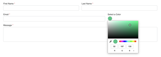
Don't forget to include the custom CSS mentioned in Step 3.
The result might look something like this:
Please see MDN Web Docs for more information about Color input elements.