ConversationalImproved in 5.0+
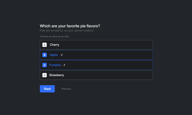
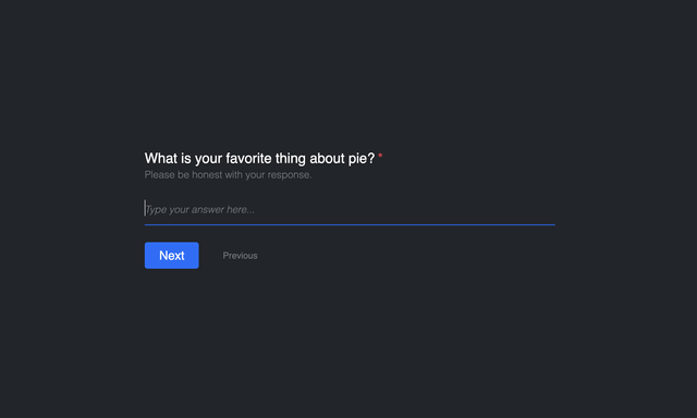
The Conversational formatting template will display 1 field at a time, and smoothly scroll down to the next question until complete. It will appear and behave similarly to how Typeform displays forms, and is also a great choice for survey forms. This formatting template example is not dependent on any frameworks, comes complete and does not require any additional styling unless you wish to do so. You can place the CSS and JS inside the formatting template or add to your site's CSS / JS files.
Please note that this formatting template example has some expectations and limitations:
- You should typically only place 1 field per row. Multiple fields in the same row will otherwise appear stacked on the same page (which may be okay in some cases).
- Do not include a Submit button in the form layout, as this template adds one automatically.
- Groups, Credit Card/Payments, and Save & Continue Later fields/buttons currently are not accounted for in this example. They can of course be added if you put in the work to support it.
- Multipage forms are not recommended to be used with this formatting template example.
Preview
Video: Preview of Formatting Template Examples
Templates

{# CSS overrides #}
{% set cssPath = view.assetManager.publishedUrl('@freeform-formatting-templates/conversational/_main.css', true) %}
{% do view.registerCssFile(cssPath) %}

{# JS overrides #}
{% set jsPath = view.assetManager.publishedUrl('@freeform-formatting-templates/conversational/_main.js', true) %}
{% do view.registerJsFile(jsPath) %}

{% import "freeform/_templates/formatting/conversational/_row.twig" as rowMacro %}

{# Render the opening form tag #}
{{ form.renderTag({
    attributes: {
        form: { class: "freeform-form", "data-freeform-conversational": true },
        row: { class: "freeform-row" },
        success: { class: "freeform-form-success" },
        errors: { class: "freeform-form-errors" },
        novalidate: true,
    },
    fields: {
        "@global": {
            attributes: {
                container: { class: "freeform-fields" },
                input: {
                    class: "freeform-input",
                },
                label: { class: "freeform-label" },
                instructions: { class: "freeform-instructions" },
                error: { class: "freeform-errors" },
            },
        },
        ":required": {
            attributes: {
                label: { "+class": "freeform-required" },
            },
        },
        ":errors": {
            attributes: {
                input: { "+class": "is-invalid has-validation" },
            },
        },
        "@signature": {
            attributes: {
                input: { "-class": "freeform-input" },
            },
        }
    }
}) }}

{# Success and error message handling for non-AJAX forms #}
{% if not form.settings.ajax %}
    {% if form.submittedSuccessfully %}
        <div{{ form.attributes.success|raw }}>
            <p>{{ form.settings.successMessage | t('freeform') }}</p>
        </div>
    {% endif %}
    {% if form.hasErrors %}
        <div{{ form.attributes.errors|raw }}>
            <p>{{ form.settings.errorMessage | t('freeform') }}</p>

            {% if form.errors|length %}
                <ul>
                    {% for error in form.errors %}
                        <li>{{ error }}</li>
                    {% endfor %}
                </ul>
            {% endif %}
        </div>
    {% endif %}
{% endif %}

{# Display form field rows and columns #}
{{ rowMacro.render(form.rows, form) }}

{# Render the closing form tag #}
{{ form.renderClosingTag }}
{{ field.render }}
JS
The following JS is a supplemental starting point to handle additional elements in the form.
// Adjustments for Success and Errors classes
document.addEventListener('freeform-ready', function (event) {
  event.options.errorClassBanner = 'freeform-ajax-form-errors';
  event.options.errorClassList = 'freeform-errors';
  event.options.errorClassField = 'freeform-has-errors';
  event.options.successClassBanner = 'freeform-ajax-form-success';
});